Last week, the results of the Writer’s Digest 21st annual Self-Published Book Awards were announced. I didn’t win. It was a hundred bucks down the drain and a predictable bit of a blow to my pride, but that’s okay. You win some, you lose more. What was nice about the contest, however, was that every single entry got a judge’s commentary, and mine was actually very positive. The judge had shortlisted The Last Death, which kind of made me feel better, and had good things to say about the plot and characters.
He or she didn’t have great things to say about my book cover, however. Personally, I really like it. But the judge thought it was “plain” and suggested something more exciting, like “healing wounds or a picture of a battle.” While my first instinct was to say “ugh” and close the email, it got me to thinking. Based on the scoring system, my “plain” cover was probably the deciding factor that led the judge to cross my name off the list.
And that got me thinking some more. Book covers are basically advertisements, and the conventions for each genre are as clear as signposts on the highway. The brooding hooded figure with a sword is going to lead you to a fantasy novel. The impossibly muscular square-jawed hero who forgot his undies is going to lead a romance, and the hot woman in a popped-open button down holding a pistol is bound to be a detective story someone hopes will be described as “steamy”.
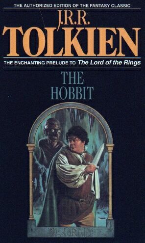
These are good things, to some degree. You want your reader to be instantly attracted to your book, and giving them a clear signal about what’s inside can guide eyeballs to what you’ve got to offer. But for self-publishers, these conventions can be a pretty big hurdle. They’re expensive to get right, and the pros don’t always even manage it. I can’t tell you how confusing it was for me as a child when the first version of The Hobbit I encountered was this familiar gem.
Book covers are supposed to set the tone for your novel, but that Bilbo was not the same hobbit I read about when I turned to page one. It was one artist’s interpretation, but it wasn’t mine, and I think it influenced me pretty deeply, especially when I started collecting beautiful, minimal, elegant editions like these.
And that’s why I really dislike figurative artwork on the covers of my books, and why I don’t think “plain” is necessarily a bad thing. I would rather have a blank white cover than a badly drawn scene or a cobbled-together photograph. Especially as a self-publisher, because badly drawn scenes are still considered the norm for DIY authors. I would rather have minimal design and let my reader imprint his or her own imagination on the text rather than set up expectations that are inaccurate or misleading.
I know it’s not a popular opinion, especially since the conventions I mentioned earlier are so deeply embedded in the current publishing climate. But interesting fonts and carefully-themed colors can accomplish many of the same visual goals. With hundreds of thousands of authors competing for the same attention spans and all trying the same things, couldn’t spare elegance jump out from the crowd?
Maybe it’s more of a hope than a reality, at least in the genre world. Literary fiction often goes spare, but it also has very different expectations. A book that’s well-written can gather buzz and sales no matter what it looks like, but I don’t have enough evidence to say for sure that figurative art is a must in indie fantasy.
What do you think? Do you go minimalist, or do you prefer to have characters and scenes on your covers?


I’ve heard/read to stay away from the common fantasy cover of some group of adventurers going out and killing stuff. I’m more for the minimalist as well, using a symbol. Symbols seem pretty popular on book covers.
I definitely think a minimalist cover with a colorful background and interesting font title or perhaps a picture which stands out in an otherwise blank background grabs my attention more than some full-pages picture. As a kid I loved the full page battle cover but as I grew older then simpler covers seemed more elegant and striking.
I now want to have my book published in several ‘collectable’ discount paperback editions with absurd artwork that in no way resembles the contents. That link is the best thing i’ve seen since Least Helpful.
The traditional fantasy cover art completely turns me off of a book. It’s why I’ve never read anything by Robert Jordan. Those covers are just too cheesy and cliche, which makes me think the contents will also be cheesy and cliche. I prefer something more minimalist that sets the tone and hints at what’s inside.
I used to be a big fan of Robert Jordan when I was in high school, but…yeah. The cheesy covers pretty much match the cheesy insides.